Create a theme park app feature that helps parents reunite with their lost children
Role
UX Designer
Tools
Figma
Platform
iOS
Skills
User Research·Personas·Interviews·User Journey·Iterative Prototyping·User Testing·Interaction Design·Validation Testing·Product Strategy·High-Fidelity Mockups
Problem
Sometimes even the best parents can lose track of a young child at a crowded theme park. The process of reuniting a parent and lost child often involves anxiety, stress, and fear for both the parent and child. How can we use technology to help streamline this process?
View fullsize
Overview
The goal of this design is to create a feature for an existing theme park app that helps parents in a crowded theme park reunite with their lost children.
Approach
DISCOVER
What problems do people have today when parents lose their child at a crowded theme park?
ASSUMPTIONS
The main assumptions at this stage were:
Theme park app is installed on a large number of smartphones for guests and park workers
Children do not have a smartphone or other tracking device
There is a trusted security team within park workers that
specializes in helping reunite parents with lost children
For children’s safety, privacy and trust are important
Internet Intuition
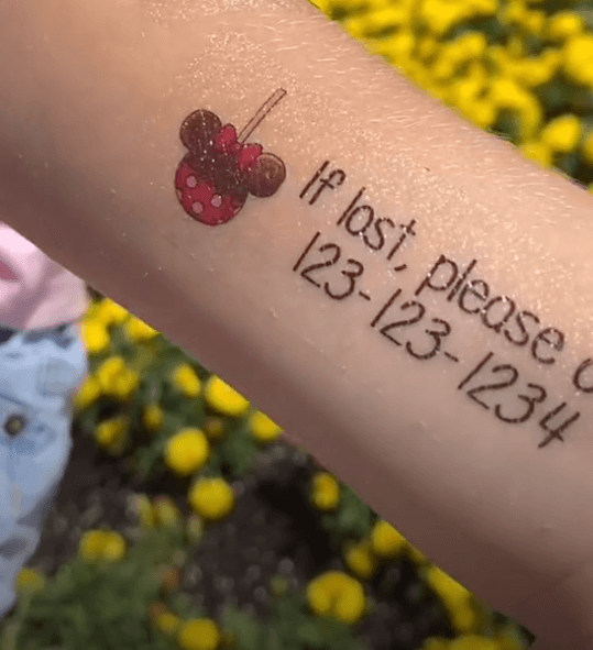
Child safety temporary tattoo
To get a general sense for what parents currently do in this scenario, I turned to online forums and articles. Building this intuition helped guide and form my approach to the questions asked during the user research phase.
Some interesting insights were as follows:
Parents are advised to retrace steps first, then call park security
Memory can falter in stressful situations
Take a “before” picture of child upon entering park
Have child memorize phone number and put it in writing, whether on a card, tag, bracelet, temporary tattoo, etc.
Having a bad actors kidnap or otherwise harm a child is statistically rare, compared to the amount of people that would report and return the child safely at a theme park
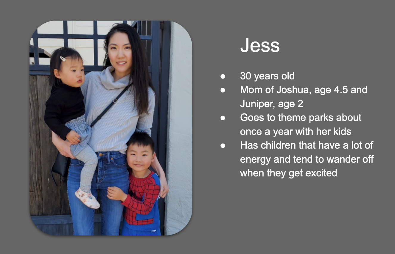
PERSONAS
In order to focus the design and cater it to a real user, I created a persona based on the user I interviewed as part of the user research phase.
View fullsizeUser persona based on Jess and her family’s needs
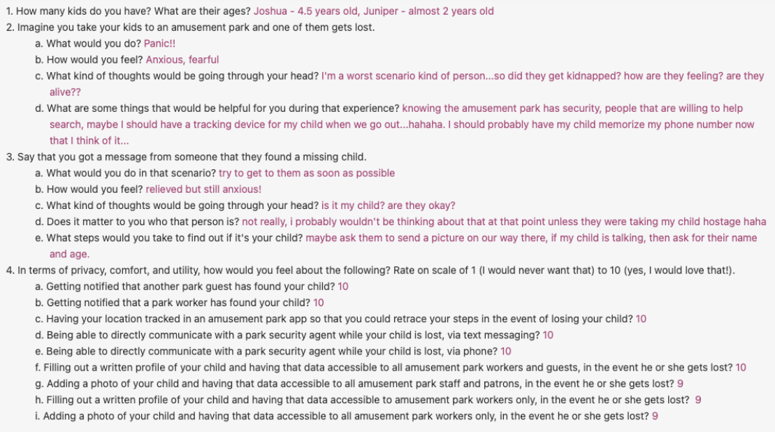
Questionnaire
Due to time constraints, I asked the user to answer a set of questions based off of her experience with a simple questionnaire. Some surprising insights that came from the data that challenged some of the initial assumptions made, especially in relation to privacy and security.
User research questionnaire
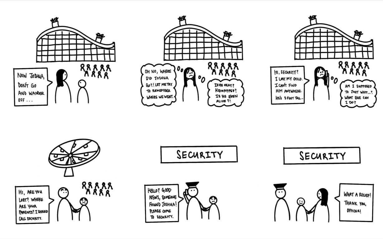
Journey Map
To better empathize and understand the user’s current experience as a parent losing their child at a crowded theme park, I synthesized the information discovered during the research phase thus far to make journey map. This helped pinpoint existing opportunities and pain points within the current experience that could be further explored.
Journey map of user’s current experience when losing a child at a crowded theme park
INSIGHTS
After synthesizing this information in the context of the current experience, I discovered some interesting insights that would guide the design process from this point on:
Emotions — Parents’ panic and fear are central to their experience in this scenario. A good design should not only cater to usable functionality for the user, but also aim to address some of the panic, fear, and other emotions that come up when using this feature.
Trust — Based on direct user feedback, in general it did not matter to the parent who found their child, it was mostly just a relief that somebody found them. Also based on internet research, I also learned that it was statistically rare for bad actors to kidnap or harm the child**.**
Privacy — In the beginning of the process, I had originally predicted that users would be extremely hesitant to submit potentially sensitive data about their children to the app, but after asking the user I learned that privacy is less of a hindrance than I had originally predicted.
Communication — After mapping the current journey, it became clear that the current experience usually involves a series of phone calls and a lot of anxious waiting.
Checking Assumptions
Based on the surprising insights that came up about trust and privacy, I made a decision that building out a completely robust safety mechanism was not a primary focus for the first iteration of this app feature. Instead, two important decisions came about at this stage:
To keep a baseline level of trust, I added an assumption that going through the park security team would be a trusted intermediary, and that they have some mechanism of securely verifying the identity of the parent retrieving a lost child.
In the design, I wanted to make sure that aside from a child’s photo, no other profile data is released to the other park guest and workers, and made an assumption that the full data can only be fully accessed by the trusted security team. A child’s photo reveals no more data than would have been already exposed in real life, when a lost child is seen at a crowded theme park.
Opportunity
Today, the process of reuniting parents with children at a theme park requires relying on discrete phone communication, recall of locations and details about the child according to the parent’s potentially fallible memory, and chance encounters by park guests and workers.
Parents need a more robust, streamlined, and transparent process for finding a lost child in a crowded amusement park because the entire experience is highly stressful and emotional.
Requirements
Include some direct, continuous form of communication between parent and park security
Rely on detailed, accurate data instead of parent’s memory recall in emotional states of panic and anxiety
Allow for information about a lost child to be proactively given to anyone who could potentially come into contact with the child
Minimize child data exposure to park guests, while retaining feature functionality
Explore
Flows
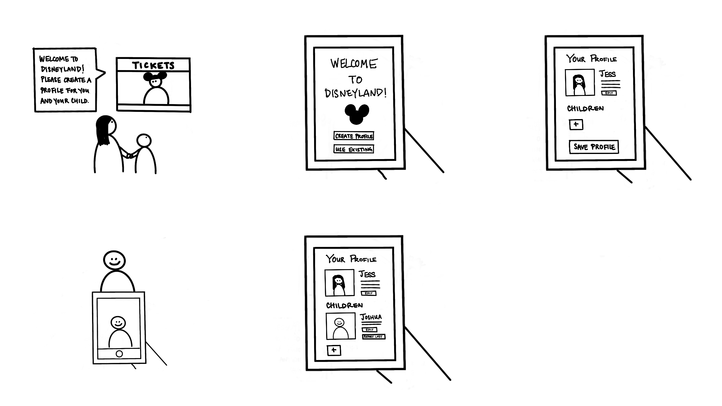
The first iteration of the design focused on two main user flows: profile creation and lost child reporting.
Profile creation flow
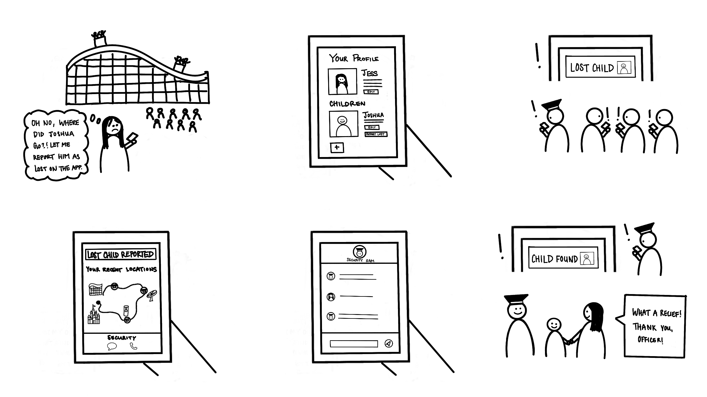
Lost child reporting flow
Wireframes
At this stage, I created wireframes to bring the concept to higher fidelity. This helped guide aspects of the design, such as layout and CTA placement.
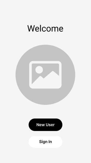
View fullsizeWelcome screen
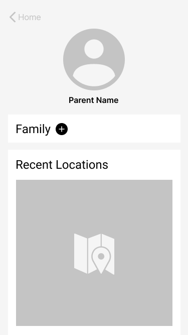
View fullsizeParent profile page
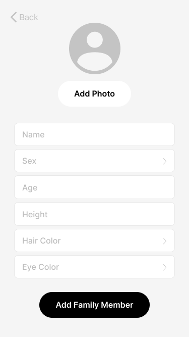
Adding child profile information
View fullsizeChild profile successfully added to parent’s family
View fullsizeLost child report page
View fullsizeSecurity team chat
Solution
Hi-Fidelity Mockups
After getting feedback about the wireframes, there were some elements that changed for the final design:
Some of the lesser-known icons, such as the “Report lost child” icon, are ambiguous and confusing. Additionally, having only an icon as a button is not as clear or accessible as having both an icon and description as part of the button. This design adds text to most icon buttons unless it is a ubiquitous, recognizable icon for the average user.
For mobile, the typical convention is that the main CTA is on the right hand side of the screen.
Visually, the card design style was serving its purpose in grouping relevant content but once colors were added to the design, it added visual complexity. In the end, I decided to remove the card style in order to simplify and condense the visual design of the feature.
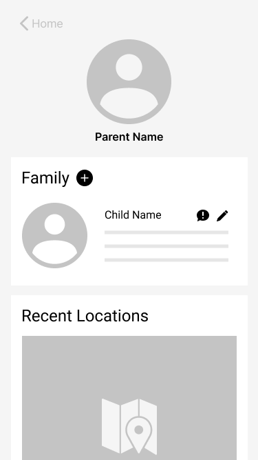
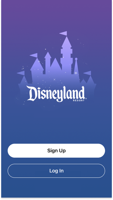
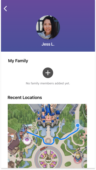
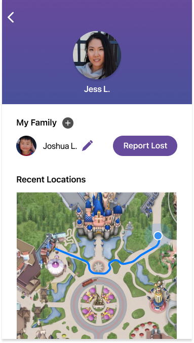
Upon entering Disneyland, Jess creates a new profile and allows the app to track her location.
View fullsize
View fullsize
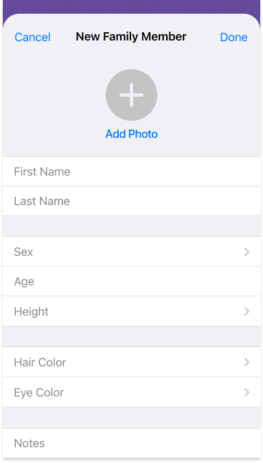
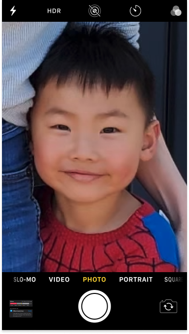
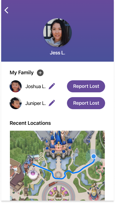
She then adds a family member profile for her son Joshua, and takes a photo of him.
View fullsize
View fullsize
They’re now ready for a fun day!
View fullsize
... except while they were in line for cotton candy, Joshua makes a mad dash for Mickey Mouse and gets lost in the crowd.
Panic!
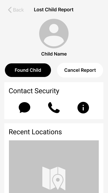
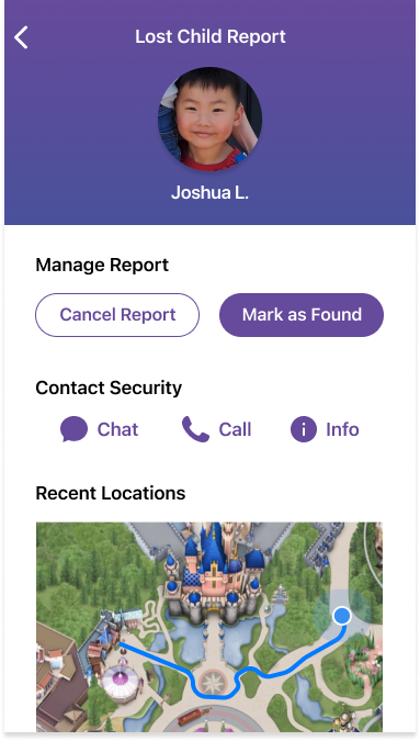
Jess remembers the app and selects the “Report Lost” icon next to Joshua’s profile link to report him lost to security and other park guests.
View fullsize
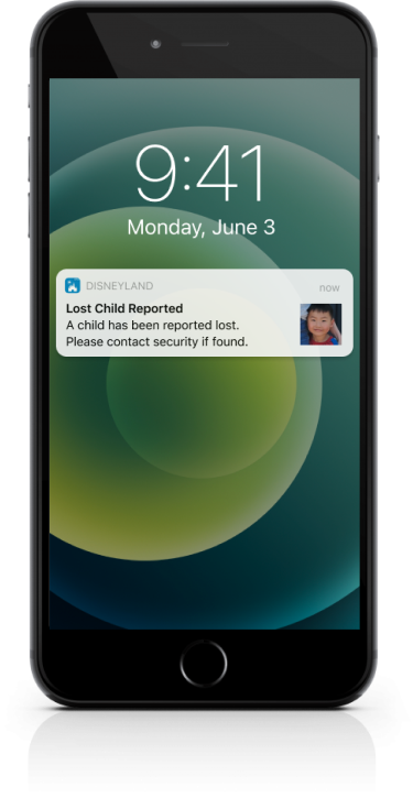
Immediately, all park guests and workers get a push notification so they can keep a look out for Joshua.
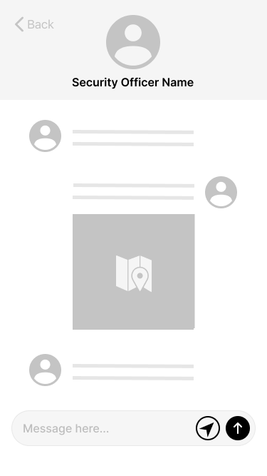
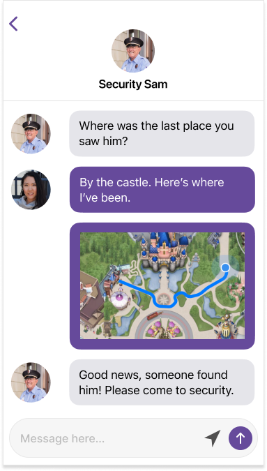
Meanwhile, Jess retraces her steps using the recent locations map and starts a chat with a security agent.
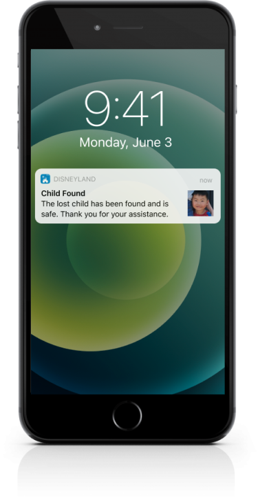
After sending the security agent a map of her recent locations, a park guest finds Joshua and brings him to a security officer, who marks him as found.
All park guests and security receive the notification immediately. Relieved, Jess picks Joshua up at security and they enjoy the rest of their day!
Results
User tests
At this stage, I gathered additional feedback about the project. Some of the main concerns were:
Safety — This first iteration operated under the assumption that the security team would be the trusted intermediary and take necessary steps to ensure the lost child is returned to the parent safely. A more robust safety system within this app feature could also provide additional layers of assurance for parents using the app.
Sample size — There was feedback that though the user interviewed for this project was generally comfortable sharing potentially sensitive information about her child through the app, that might not be the case for every user of the app. Due to time constraints, I focused on one user’s needs, preferences, and goals for the first iteration, but doing additional user research and expanding my understanding of different users could potentially lead the design in a different direction in future iterations.
Extensions
Potential extension features outside the scope of this project could include:
A welcome notification that reminds returning parents to update child photo when entering park
Apple business chat for chat interface on iOS
QR code wristband for child along with entry admission that links to child's profile. Whomever finds child can scan and both parents and security would immediately be notified child is found
Lessons Learned
Take Time To Empathize
The time and effort taken to truly empathize with the user using tools like questionnaires and journey maps, really helped build a more comprehensive understanding of the user. Through this discovery process, I discovered insights I otherwise would not have, such as catering to not only the functionality of reuniting a parent with their lost child, but also addressing some of the emotional anxiety, stress, and fear that the parent inevitably feels when a crisis like this occurs in their life.
Check Your Assumptions
One of the biggest surprises along the journey of designing this feature was when I discovered through my research that the fear of bad actors harming the lost child is actually more tempered than what I had originally anticipated. Not only did the internet research suggest that it is statistically unlikely, but also validating the idea through direct user feedback that as a parent they’re generally more concerned about reuniting with their child, allowed me to narrow the scope of the first iteration designs for this project.
Visualize Your Designs
Between the wireframe and hi-fidelity mockup stages, there were multiple designs and ideas that were tested. For instance, the visual card style seemed like a great approach during the wireframe stage, but when I brought the design to higher fidelity with colors, typography, etc. it started to become clear that another visual style would bring more simplicity and appeal to the overall look and feel of the app. Feedback about iconography and recognition also influenced the design between stages, to increase recall and learnability of the app.