StarLogo Nova Drawers

Redesign the block drawer for an educational 3D simulation game for kids
UX Designer, Software Engineer, Front-End Engineer
Engineering Manager
Context
StarLogo Nova is an educational, web-based 3D simulation engine that allows users to use blocks to program and build games. The block drawer is a core functionality that allows users to select programming blocks based on "drawer" categories.
Starlogo Nova drawer design shown in the context of an example game simulation project.
Problem
The block drawer for StarLogo Nova's game simulation interface was clunky and confusing, The main problems leading to a frustrating overall user experience were:
- The previous design made it difficult to discover and browse between different block types
- New users found it difficult to build familiarity with the interface
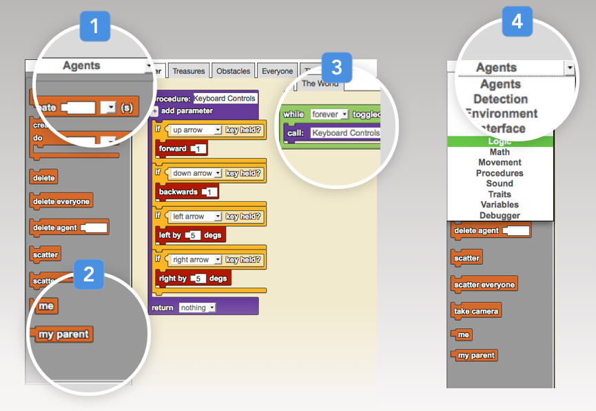
Starlogo Nova drawers terminology and pain points
- Selected drawer has no visual indication it is selected
- Drawer itself is a finite container that does not allow easy switching between drawers
- Two linked blocks in programming area
- Drawer names are displayed with a regular dropdown menu with no visual separation between drawer types
Overview
The new block drawer design needed to allow for spatial organization and to improve visual categorization between different drawers.
Approach
User interviews
In order to better understand problems with the old design, I conducted task-oriented user tests. Common frustrations with the block drawer were that it lacked discoverability and browsability, and users found it difficult to build familiarity with the interface.
Personas
Based on user interviews, I came up with two main user personas: students and educators, each with different needs based on their level of mastery using our program.
Student
- Aged K through 12
- Overall assumed to be a novice user of Starlogo Nova
- New to block-based programming, high desire for learnability and browsability
- Often relies on drawer color-coding and spatial arrangement
- Sample use case: student views peer's projects and would like to find the same blocks to use in their own project
Educator
- Adult who often helps students
- Assumed to have some level of mastery of Starlogo Nova interface
- Often relies on drawer names and spatial arrangement
- Desires to leverage current proficiency with the program
- Would prefer similar spatial layout and color coding to existing interface
Static mockups
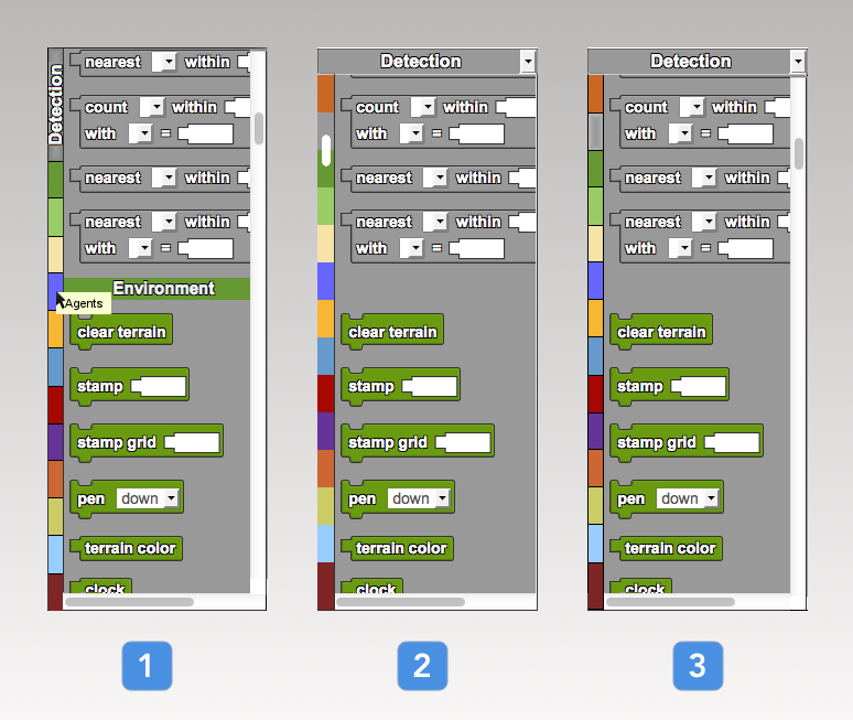
Next, I created two iterations of static mockups for the block drawer redesign, exploring ideas for infinite scrolling drawers with color-coded drawer names. The first iteration was based on variations with scroll bar position, equal-sized drawer shortcuts, and how to display label descriptions.
View fullsizeFirst iteration mockups
- Left side buttons with equally sized side colors and hover label
- Left equal scroll between drawers
- Left equal drawer colors with right scroll and shadow on active drawer
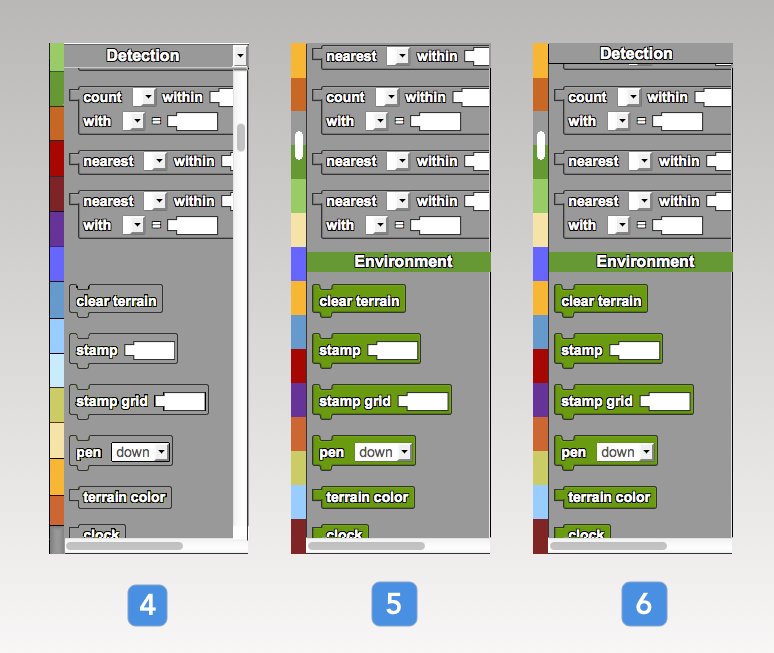
View fullsizeFirst iteration mockups (cont.)
- Left equal scroll, ordered color strip with right scroll
- Left equal scroll with integrated drawer labels and no top drawers
- Left equal scroll with integrated drawer labels and top drawers
After testing these static mockups with users, I narrowed down which designs were most effective by incorporating feedback and creating another round of mockups.
Implementation Note
In order to limit structural dependency issues across the shared Scriptblocks framework, I needed to ensure backwards compatibility with existing code libraries. Hence, it made the most sense to limit technical changes to CSS and JavaScript only.
Another design decision during this phase was because of browser compatibilities: block drawer names are colored only in Firefox using CSS; however, Chrome, Internet Explorer, and Safari were also targets for this project, and did not have colored drawer names due to styling idiosyncrasies.
User testing
During live user testing, two main usability problems were brought to light:
- How to visually indicate where the user is within the continuous drawer, relative to other drawers
- How to view all drawer names (for beginner users), while maintaining shortcuts that allow choice of a desired drawer based on color-association (for advanced users)
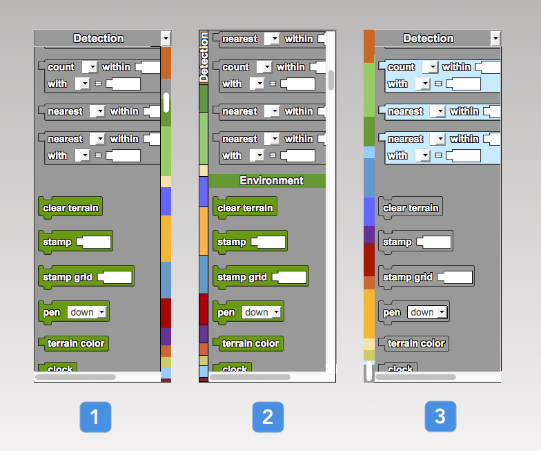
More static mockups
In order to address this new user feedback, I created more static mockups to help brainstorm possible solutions. Variations included color reordering, drawer label positioning, and proportional instead of equal sidebar colorings, to help the user know where the active drawer is with respect to the rest of the drawers.
Second iteration mockups addressing learnability and discoverability concerns based on user feedback
- Right scroll with colors and size proportional to drawers
- Left button with proportional side colors, no top drawers
- Continuous proportional left scroll
Solution
Final implementation (CSS, JS)
The core functionality of this feature was to create continuously scrolling drawers, along with colored drawer labels that change based on which drawer is currently in view.
The main design decisions made for this final stage were:
- To remove side colors altogether. If we used equal labels, it would add to misconceptions about drawer size and thus reduce spatial learnability; with proportional labels, it would be inherently more difficult to access smaller drawers
- To remove integrated drawer labels because they added more clutter in exchange for little value, compared to if we had colored drawers in dropdown menu only and a checkmark next to the active drawer
- Not to reorder colors, in order to cater to the advanced user whose existing mental model is assumed to already have colors memorized in a certain order
- Adhere to existing browser conventions to have the scroll bar on the right
This solution improves the learnability and browsability for new users, while allowing for existing power users to leverage their mastery of the old interface due to similar drawer ordering and spatial arrangement.
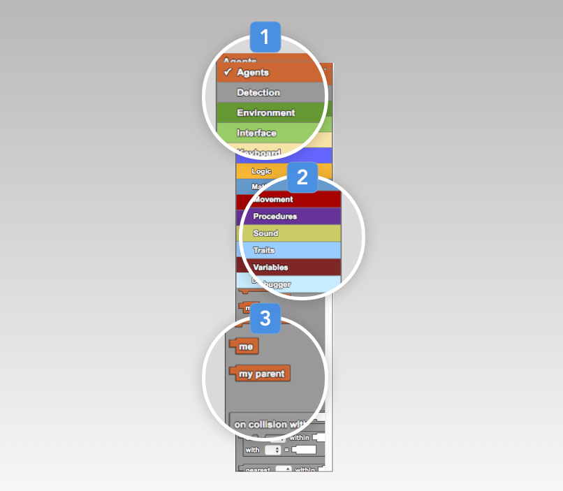
Final drawer implementation in Chrome
- Selected drawer is checked and bolded
- Color-coded drawer dropdown menu
- Continuous scroll between drawers
Results
The new drawer designs were pushed to production code. Due to timeframe of the project, I was able to fix bugs and conduct user tests after implementation but was not able to implement another development cycle. Additionally, I wrote documentation and packaged code to seamlessly hand off the project to a future developer.
Lessons Learned
Fail fast
Use low fidelity static mocks early on in the design process in addition to user testing to avoid having to rewrite implementation code.
Don't fixate, iterate
Clearly identify high-level usability problems then iteratively improve design ideas using mockups and user testing, instead of fixating on a new design, implementing it, then incorporating the bulk of user feedback near the end of the process. Always include user feedback at each possible step.
Plan for failure
Always build in extra time for bug fixes during implementation phase. Be robust.